Insono
A mobile application for simplifying and diversifying music discovery.
Overview
Discovering new music can be daunting, given limited time and uncertainty about where to look. In the age of music streaming, the abundance of songs can overwhelm users, pushing them to stick to familiar tracks and app recommendations. This reliance on algorithms rather than human context hinders fresh listening habits, trapping users in feedback loops. In response, I've created Insono, a music discovery app designed to cater to all types of users, making it easier to find new music through a straightforward and human-centered approach.
![]() 01 Discovery
01 Discovery ![]() 02 Ideation
02 Ideation ![]() 03 Design
03 Design ![]() 04 Testing
04 Testing ![]() 05 Final Designs
05 Final Designs
Insight
Music listeners often feel trapped in their established habits, exacerbated by algorithmic recommendations that reinforce those patterns. This disconnect from the music consumed discourages autonomy and makes it difficult to break free from those habits.
Solution
Insono is a mobile app that streamlines music discovery. It incorporates two essential features: crate digging and personalized curation. These features provide users with personalized music recommendations and the experience of browsing human-curated collections, reminiscent of a record store. Intrigue serves as a catalyst for user exploration, enabling them to try curated mixes and uncover hidden gems in the crates. Insono fosters a sense of exploration and allows users to build their digital record collections.
01 Discovery
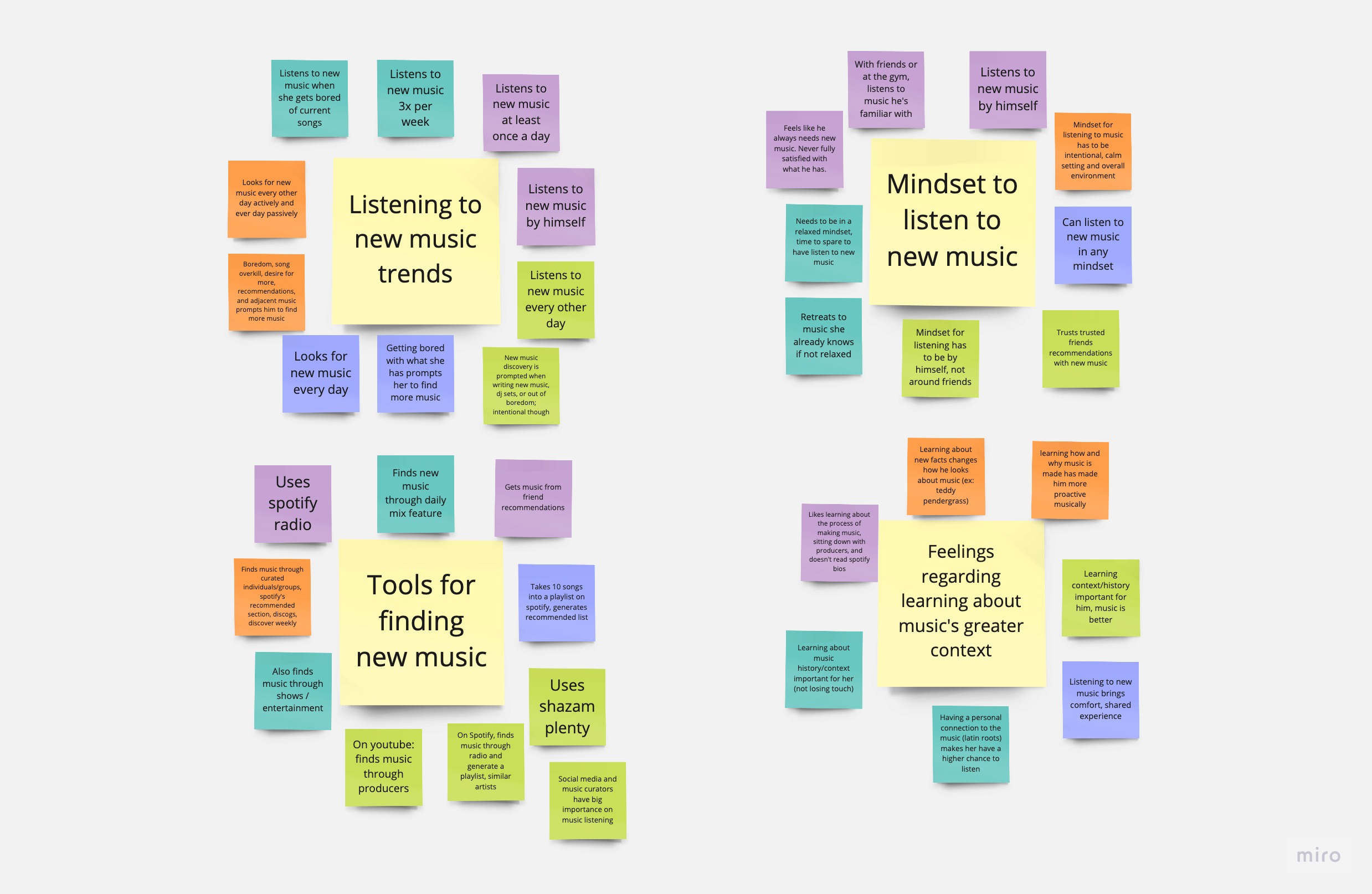
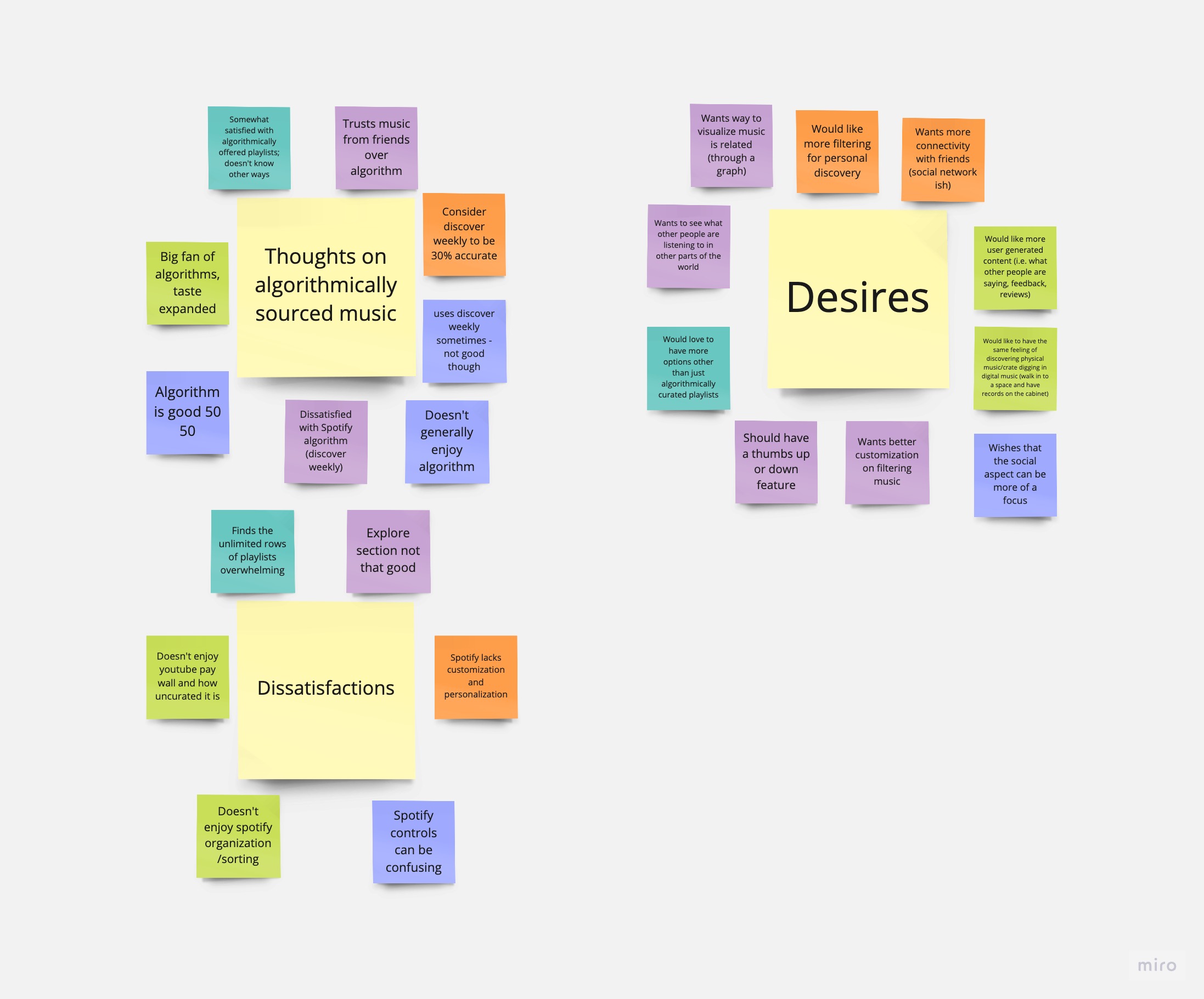
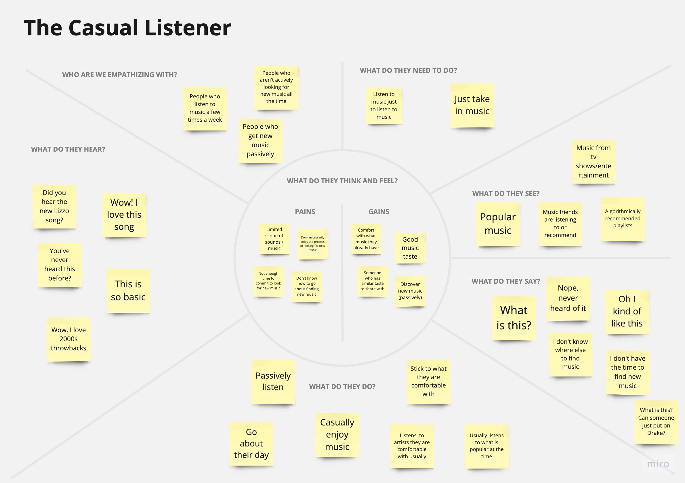
Research
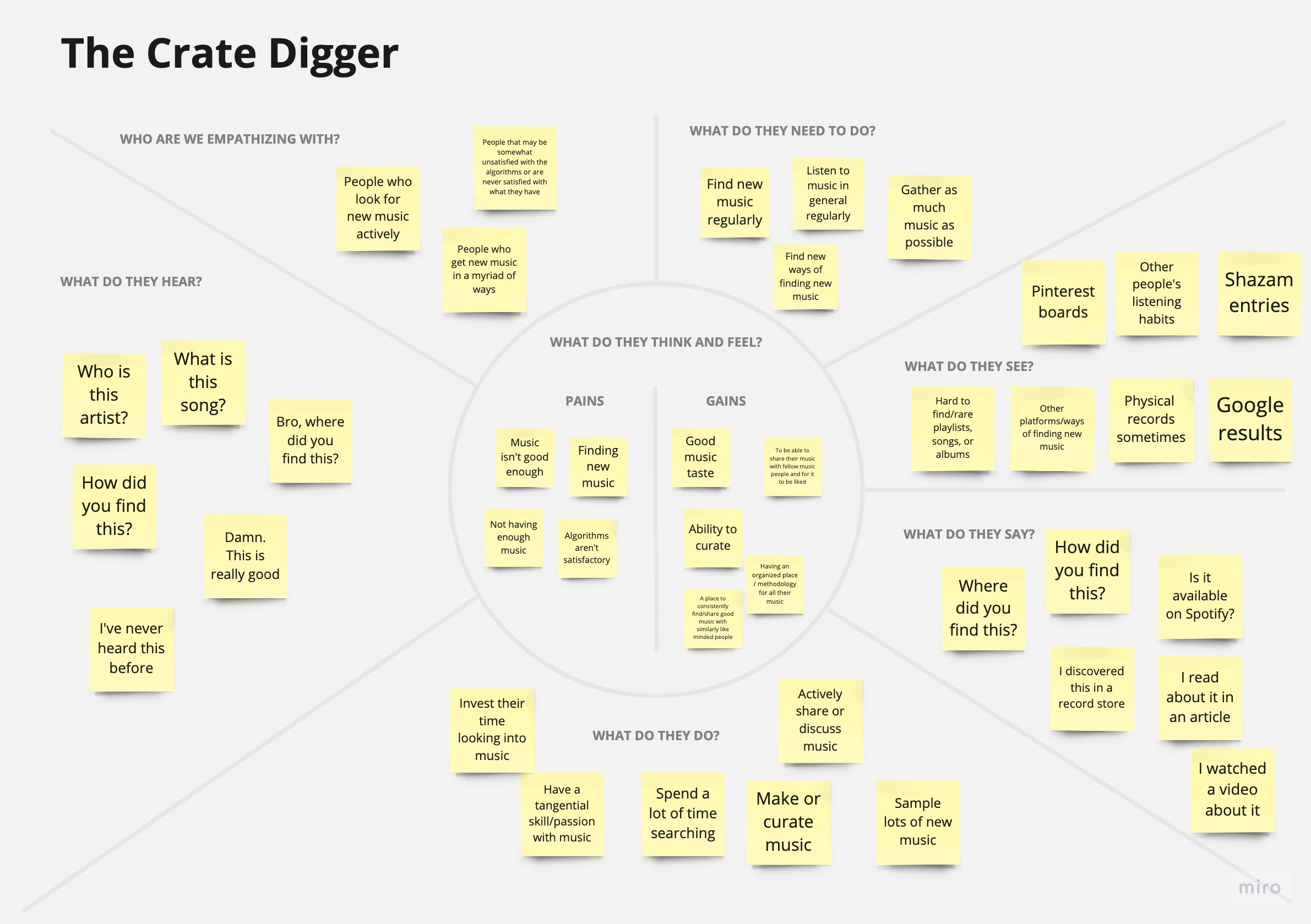
My secondary research highlighted the limitations of music discovery on streaming platforms, primarily the lack of context and personal significance in algorithm-generated playlists. This led to passive listening, where users struggled to actively engage with and retain new music. Subsequently, I conducted six user interviews, resulting in two distinct personas: The Crate Digger, who actively seeks new music and enjoys the discovery process, and The Casual Listener, a more passive consumer who finds music searching challenging and time-consuming. These personas revealed significant differences in needs and preferences between active and passive music listeners.
02 Ideation
User Flows
To determine the functions and requirements for the app's design, I prioritized them from highest to lowest importance, ensuring a positive user experience. These requirements stemmed from different user perspectives:
Advanced Filtering: Catering to music enthusiasts, the app should offer advanced filtering options for highly personalized music discovery.
Curated Recommendations: For casual listeners seeking convenience, the app should provide curated song recommendations, eliminating the need for active search.
Digital Crates Exploration: Serious music enthusiasts should have the capability to explore and discover music through curated and non-curated digital crates, enabling them to curate their playlists and collections effectively.
Trustworthy Recommendations: Users who value trusted sources of music should receive curated recommendations from individuals with good taste, rather than algorithmically generated playlists.
Focusing on the three most vital user flows—Discovering and adding albums to the library, Adding music through personalized curation, and Accessing saved albums—I mapped out these flows by action and screen to gain a comprehensive understanding of the application's requirements and design.
Sitemap
After organizing my priorities, I developed a sitemap to establish the information hierarchy for my application. The hierarchy consisted of four navigation tabs: Home, Library, Explore, and Account Settings. The home page featured two main functions: personalized curation and discovery. The Explore page focused purely on music discovery. Personalized curation provided users with personalized playlists based on their preferences. Every feature on the home page used the same crates hierarchy of Crate to albums to individual album. The goal was to emulate how you find an album in a record store.
Wireframes
The wireframes were designed from the blueprint established from the user flows and sitemap. I used these as a basis of my design that would end up being refined through usability testing.
03 Design
Branding
Insono strives for a mixture of warmth, creativity, and exploration as suggested through its cool tones of red, yellow, and white analogs. The touches of black and grey provide it with a layer of sleekness as you would experience in a refurbished record store.
UI Kit
Using my brand guide and wireframes, I designed a UI kit that takes into account different UI states for each component.
04 Testing
Usability Testing Plan
Like the earlier interviews, I created testing scripts for five usability tests with participants of varying design skills. Tasks included discovering an album, adding it to the library, using personalized curation, and accessing saved albums. After each task, I gathered feedback and organized issues by importance on an affinity map. While the app's core idea was appealing, it faced usability challenges and lacked necessary visual context. I then worked on solutions, addressing issues that ranged from straightforward to complex.
Home Page Redesign
The home page lacked visual context/cues for users to understand what the app does/offers. Interactivity wasn’t obvious. The hierarchy of information needed to be rearranged.
To solve the issue, I:
Relayed quick discovery in immediate cards so users can instantly discern a feature and established visual hierarchy to let the user know what the application offers immediately visually.
Custom Filters
Personalized curation had too many steps and aspects not applicable to everyone or not understood by the general user population.
To solve the issue, I:
Allowed the user to skip a section right below the CTA of every screen or before the curation process. OR
Asked the user what they look to filter before going through the curation process to prevent them from wasting their time.
Curation Selections
The curation selections had confused some users. Conflicting design patterns and too many actions on a screen slowed users from progressing through their curations. They also had no ability to skip or bypass any section they felt they didn't need.
Curation Results
The design patterns for personalized curation were not intuitive for users.
To solve these issues, I:
Replaced the select-all process with a more familiar design pattern. In this case, sticking to the pill pattern, disabled CTAs before a selection of music preferences for a new curation. I also removed play buttons from the curation results page and allowed the user to preview a curation before adding it to their collection.
05 Final Designs
Curation — 1
The curation process allows the user to choose how they want to filter their music. Each screen has one type of selection. The progress bar lets the user know how much they've progressed and how much remains.
Curation — 2
Ultimately, the user can select how much music they want and to save their preferences for later uses. From there, the user can preview the curation and see why it was curated for them, along with the tracklist. Once a curation is added, ir is removed from the results to confirm to the user that it is added and no longer interactable.
Crate Selection
The crate selection process focuses on viewing a collection of albums that the user can look closer into. From there, the user can add the album to their existing list of crates or a new one.
Music Exploration
Insono prioritizes music exploration and discoverability through its strong focus on recommending albums, genres, and curated collections. Since the albums are the focus and bring a lot of color themselves, I wanted to minimize color everywhere else so that the eyes are drawn specifically towards the music.